Training by watts: Getting started in the world of wattage – here’s how it works
Christoph Brenner
· 28.03.2026

What do power meter data really mean? How are raw wattage figures transformed into valuable training insights? The answer lies in a systematic approach to data collection and interpretation – the crucial foundation for successful wattage-based training. Many beginners make the mistake of diving straight into complex analyses without first building up a solid database. Yet the initial phase is particularly crucial: this is where you lay the foundations for all subsequent training optimisations. In this article, we’ll show you how to take a methodical approach to get the most out of your initial performance data.
Systematically collect wattage readings
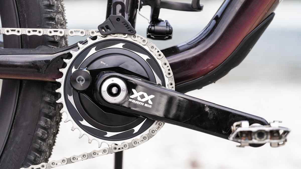
Download your data after every training session – this principle should become an indispensable routine. Whether it’s an intense interval session, a relaxed recovery ride or a spontaneous ride with friends: every ride provides valuable information about your performance progress. Many beginners underestimate the importance of seemingly ‘unimportant’ training sessions and their wattage figures. Yet it is precisely the totality of all this data that later enables you to identify patterns and assess the effects of your training. The first few weeks should be approached deliberately, without any pressure to analyse the data. The power metre automatically records all relevant parameters – from average power and maximum power peaks right through to detailed power curves. This wealth of data may seem overwhelming at first, but it forms the basis for precise training management. A common beginner’s mistake is incomplete data transfer. Make sure your power meter is correctly synchronised with the analysis software.

Classifying wattage values
Functional Threshold Power (FTP) is at the heart of the relevant wattage figures. The Functional Threshold Power (FTP) test, developed by Hunter Allen and Andrew Coggan, measures the average power output during a 20-minute maximum effort. 95 per cent of this power corresponds to the FTP, i.e. the maximum power an athlete can sustain for 60 minutes. It also serves as an indicator of the individual aerobic-anaerobic threshold (IANS). This threshold power, which you can theoretically sustain for an hour, serves as a reference value for all training zones. Without a precise FTP measurement, watt-based training is like navigating without a compass. Based on your personal FTP, you can define the seven classic training zones according to Coggan.
Training zones according to Coggan
Zone 1 (Active Recovery) is 55–75 per cent of FTP, whilst Zone 7 (Neuromuscular Power) encompasses explosive peak performances well in excess of 150 per cent of FTP. These zones are not chosen arbitrarily, but reflect different physiological adaptations. It is crucial to test these zones in practice. Consciously ride training sessions in different intensity zones to develop a feel for the respective levels of exertion. A 20-minute ride at Zone 4 (Threshold) should feel significantly different from short intervals in Zone 6 (VO₂max). These subjective experiences will later help you to interpret the objective data correctly. Don’t forget to monitor your FTP regularly. You should complete a new test every six to eight weeks, as your threshold power changes continuously as a result of training.
Interpretation of wattage values
Average power is the easiest way to get started with data analysis, but by no means the most meaningful metric. More important is normalised power (NP), which takes fluctuations in intensity into account. A ride with lots of sprints and recovery breaks can have the same average power as a ride at a steady pace, but places a completely different strain on the body. The intensity factor (IF) compares normalised power to your FTP. An IF of 0.85 means you’ve been riding at 85 per cent of your threshold power. Values above 1.0 indicate that you were occasionally riding above your one-hour power threshold – a clear sign of intense exertion. Power curves reveal more about your training than any single average value. Steady curves suggest controlled tempo rides, whilst highly fluctuating curves are typical of group rides or races. An important aspect of power measurement is the comparison between subjective perception and objective data. Sometimes a ride feels easy, even though the figures show high intensity – or vice versa. These discrepancies provide valuable insights into your current fitness level and should be factored into your training plan.
Identifying strengths and weaknesses
The power duration curve is your personal fingerprint as a cyclist. It shows the maximum power you can generate over various time periods – from explosive 5-second sprints to endurance efforts lasting several hours. This curve reveals your natural strengths and highlights areas for improvement. Sprinters typically show high values over short time intervals, whilst their curve drops sharply during longer periods of exertion. Endurance specialists, on the other hand, can maintain their power output at a relatively constant level over long periods, but rarely achieve spectacular peak values. Fatigue profiles provide insight into specific weaknesses.
Watt values as a basis for training planning
Data analysis is not an end in itself, but should lead to specific training adjustments. If the analysis shows that your 5-minute performance is below average, you should specifically incorporate VO₂max intervals into your training plan. Weaknesses in threshold performance require increased focus on Zone 4 according to Coggan. Not every training session has to go exactly to plan. If you feel tired on a planned threshold day and are unable to reach your target wattage, this may be a sign that you need to rest. Overtraining can be detected early in the data. If your performance drops continuously whilst your effort remains the same or even increases, this is a warning sign. An unusually high rise in heart rate at the same wattage can also indicate overtraining. Striking a balance between data-driven road cycling training and an intuitive feel for the ride is crucial. Wattage data is a powerful tool, but it is no substitute for the experience and body awareness of an experienced athlete.